The brief for this project was to create a re-branding for a traditional Italian restaurant that would reflect the heritage, values and visual language of classic Italian café culture.
It needed to appeal to a younger audience without excluding the older demographic (its existing audience).
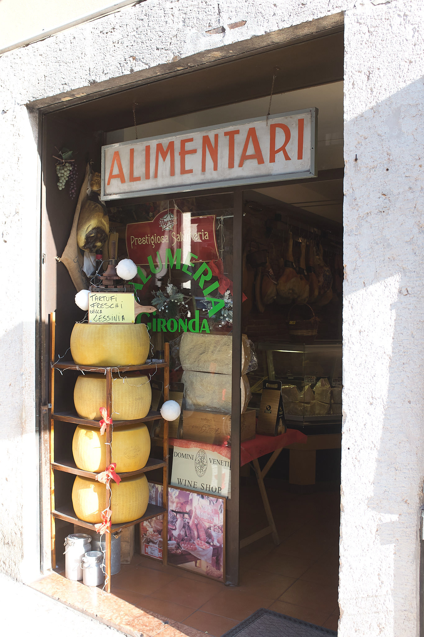
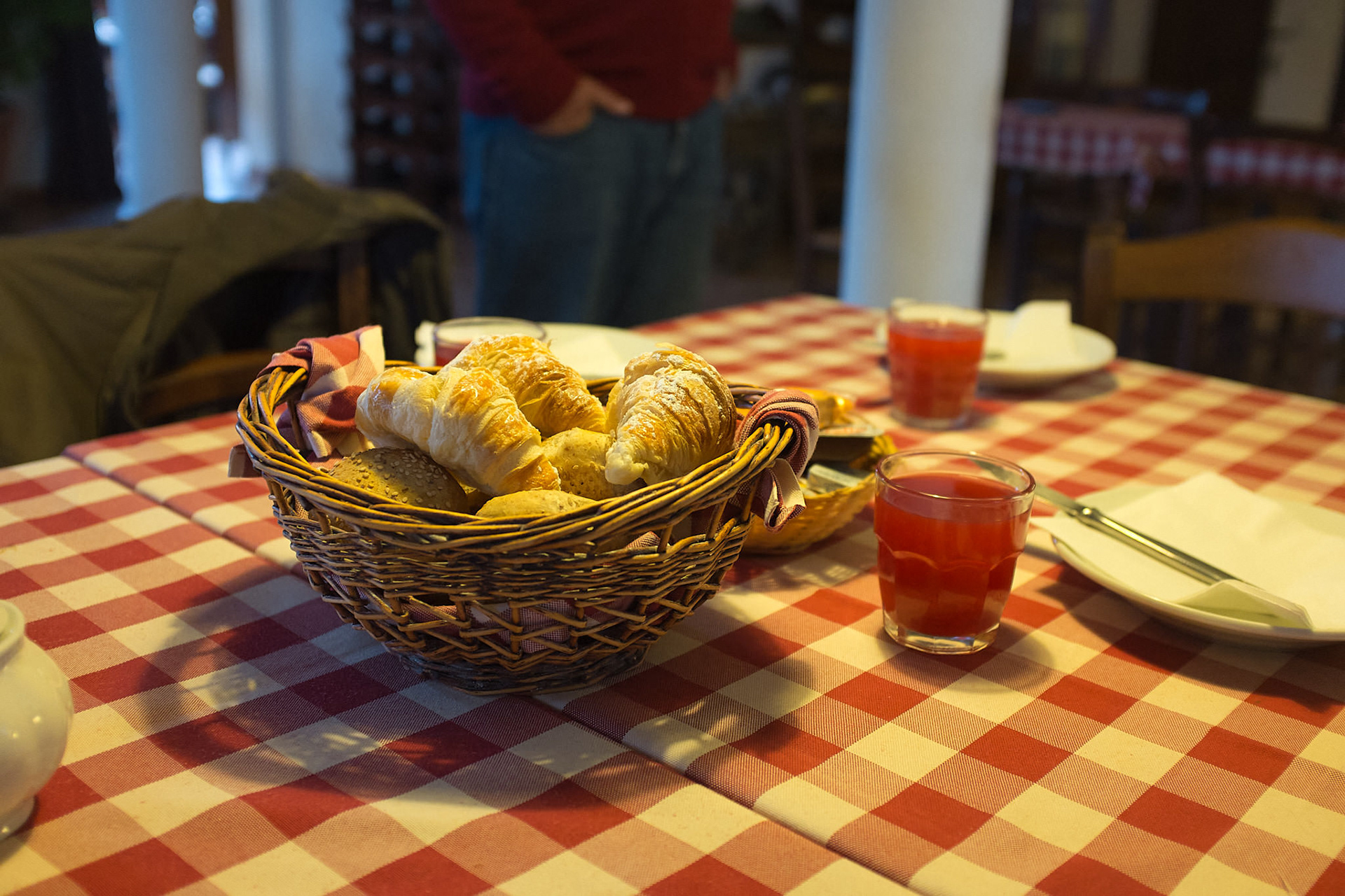
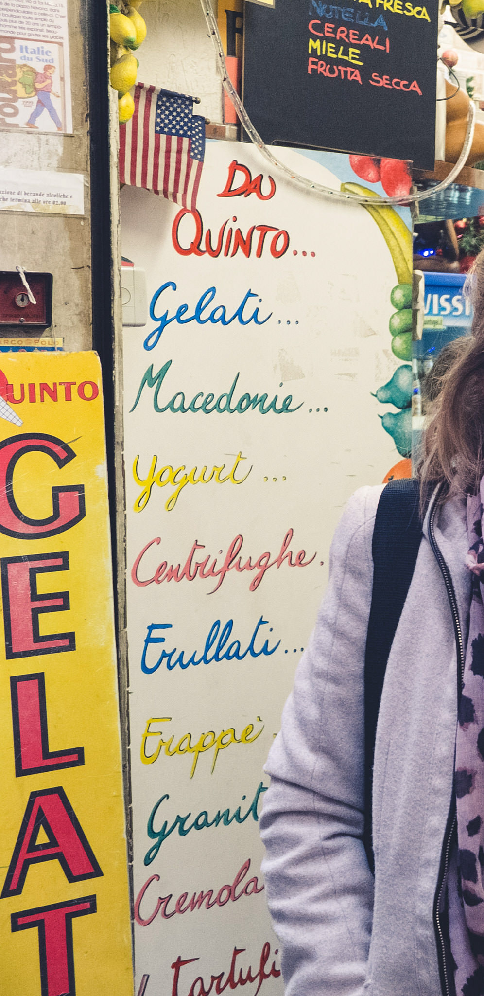
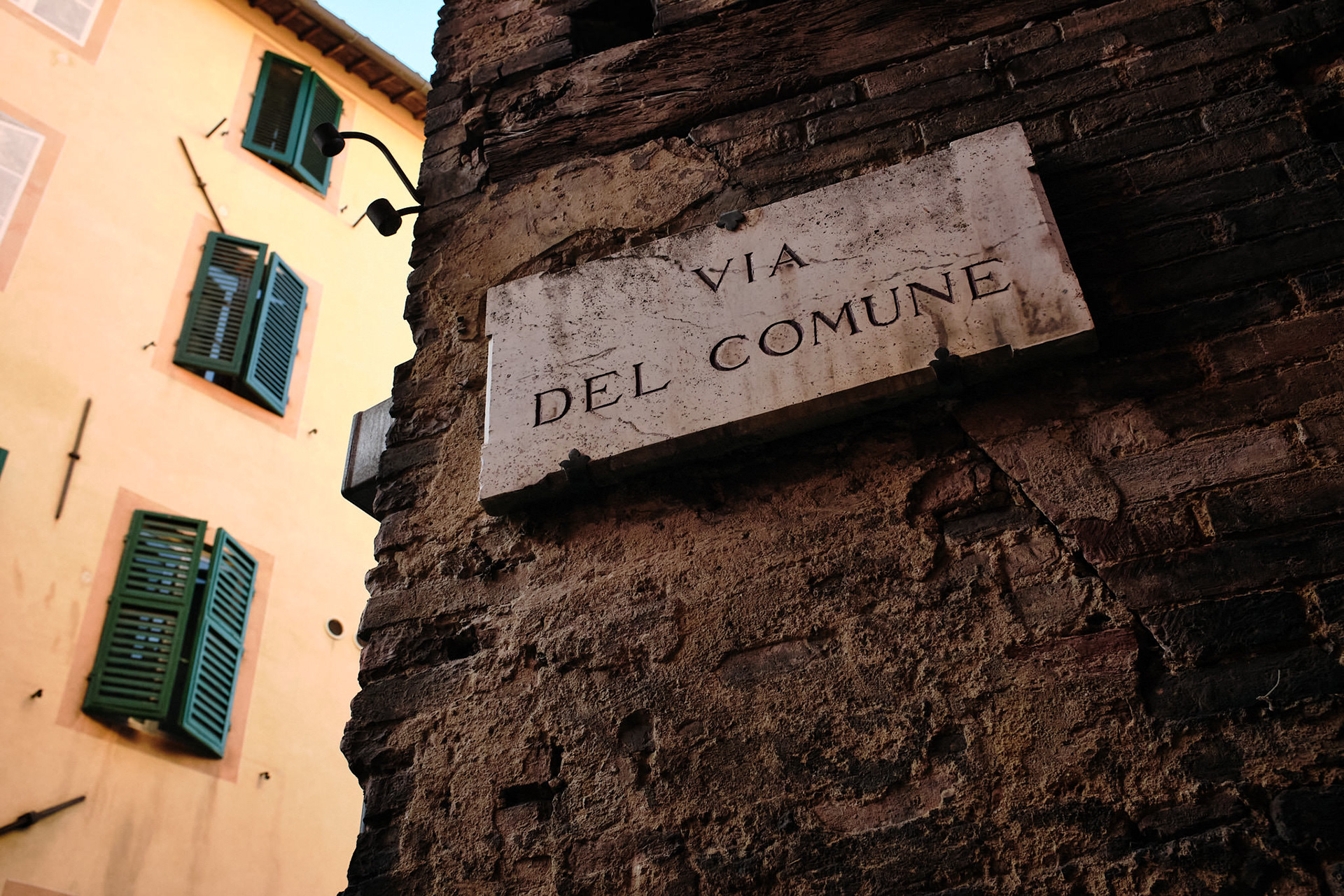
Photography is one of my preferred mediums of visual exploration and idea finding. For this project I focussed on traditional and vernacular Italian typography and colour schemes:
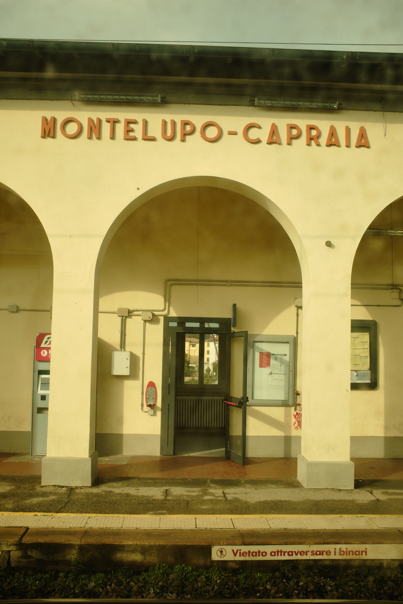
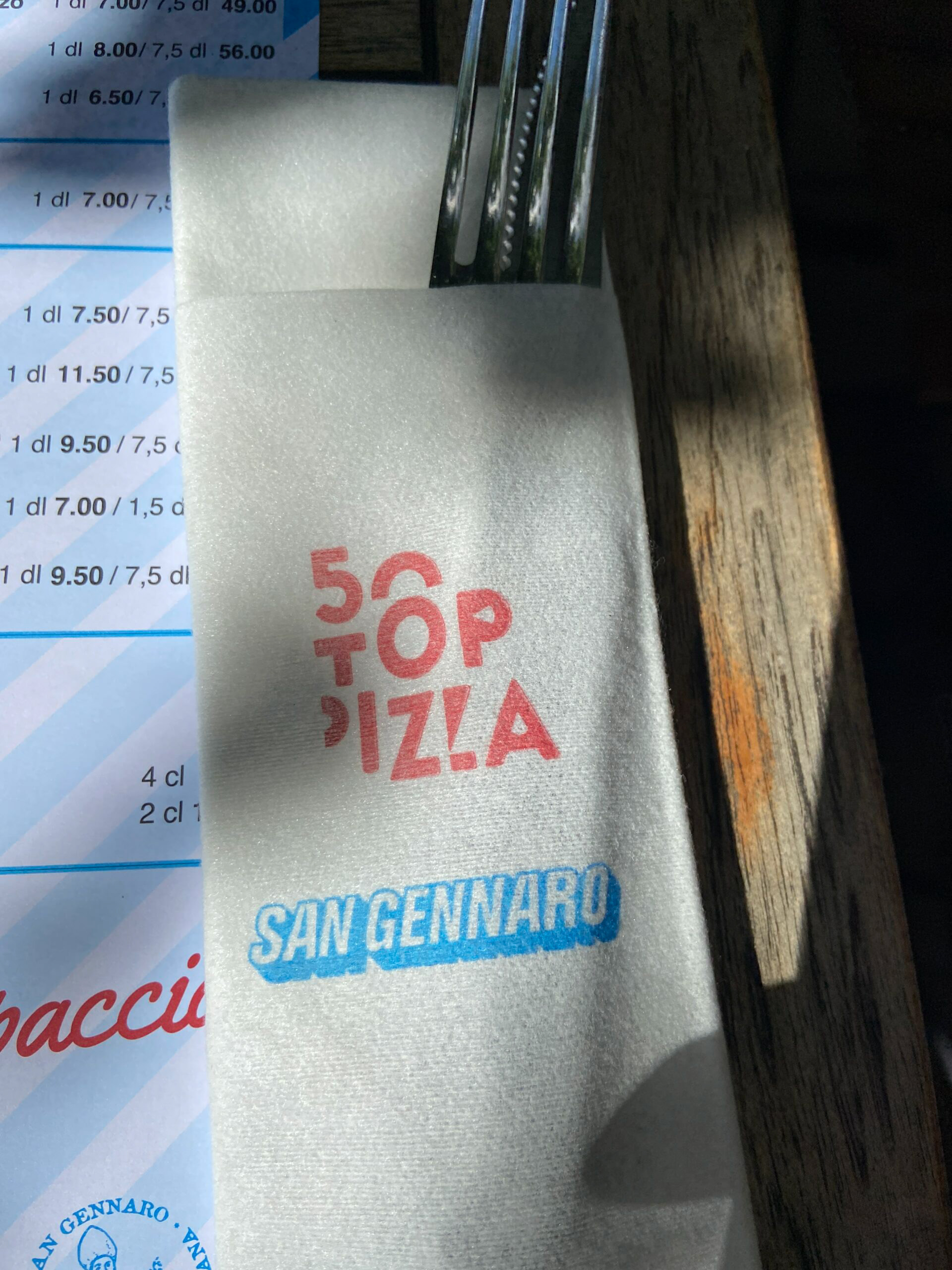
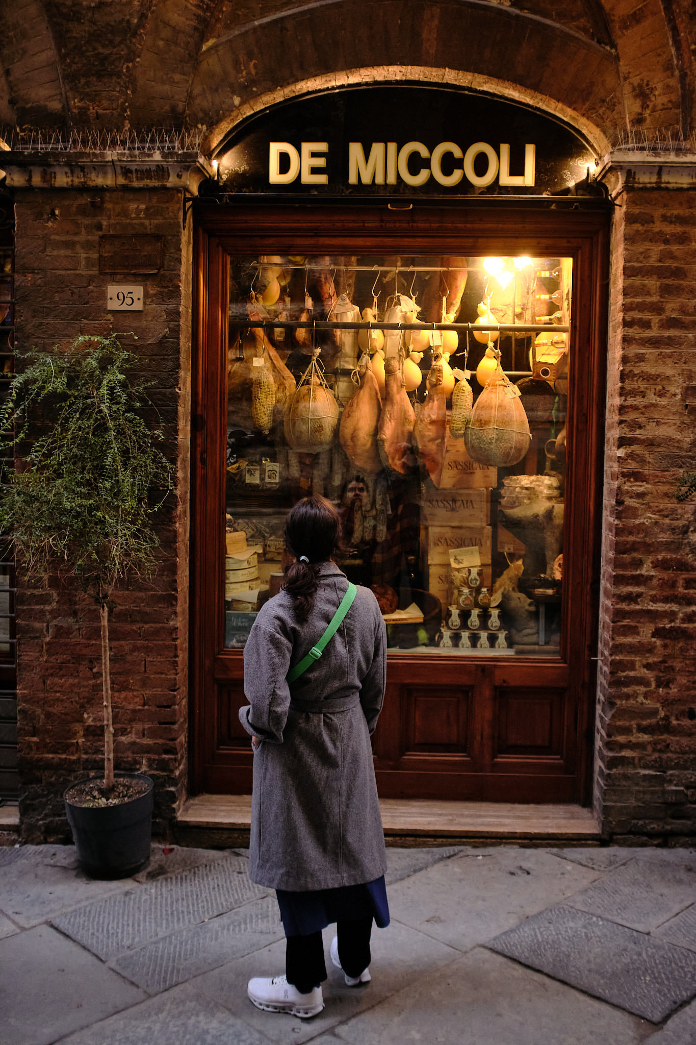
Photos copyright © Admill Kuyler
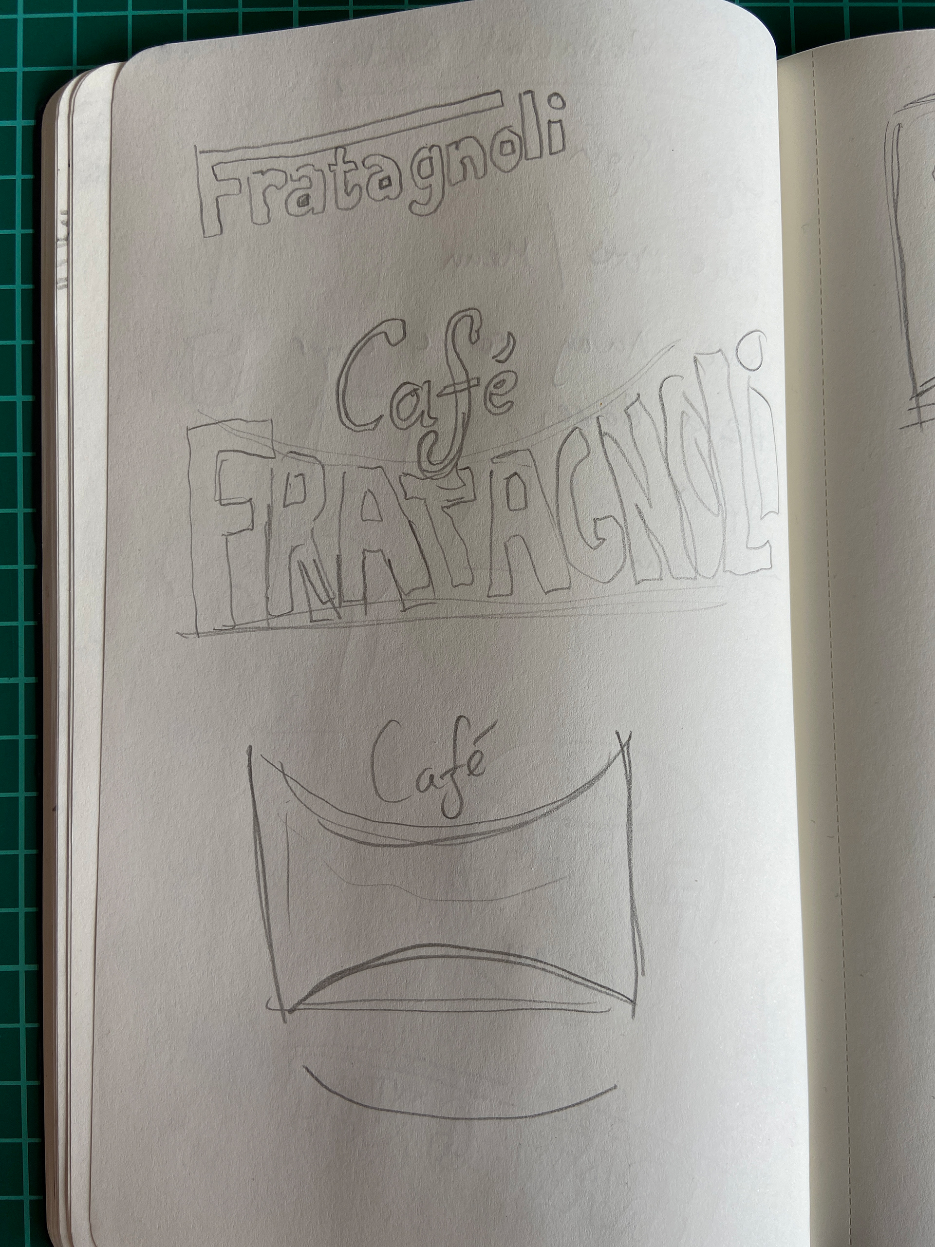
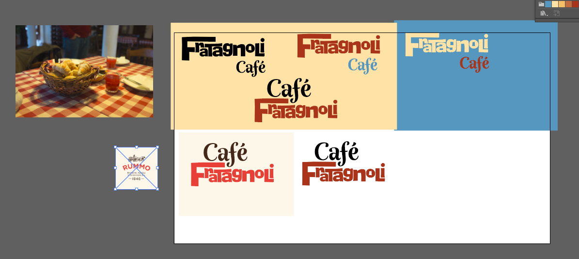
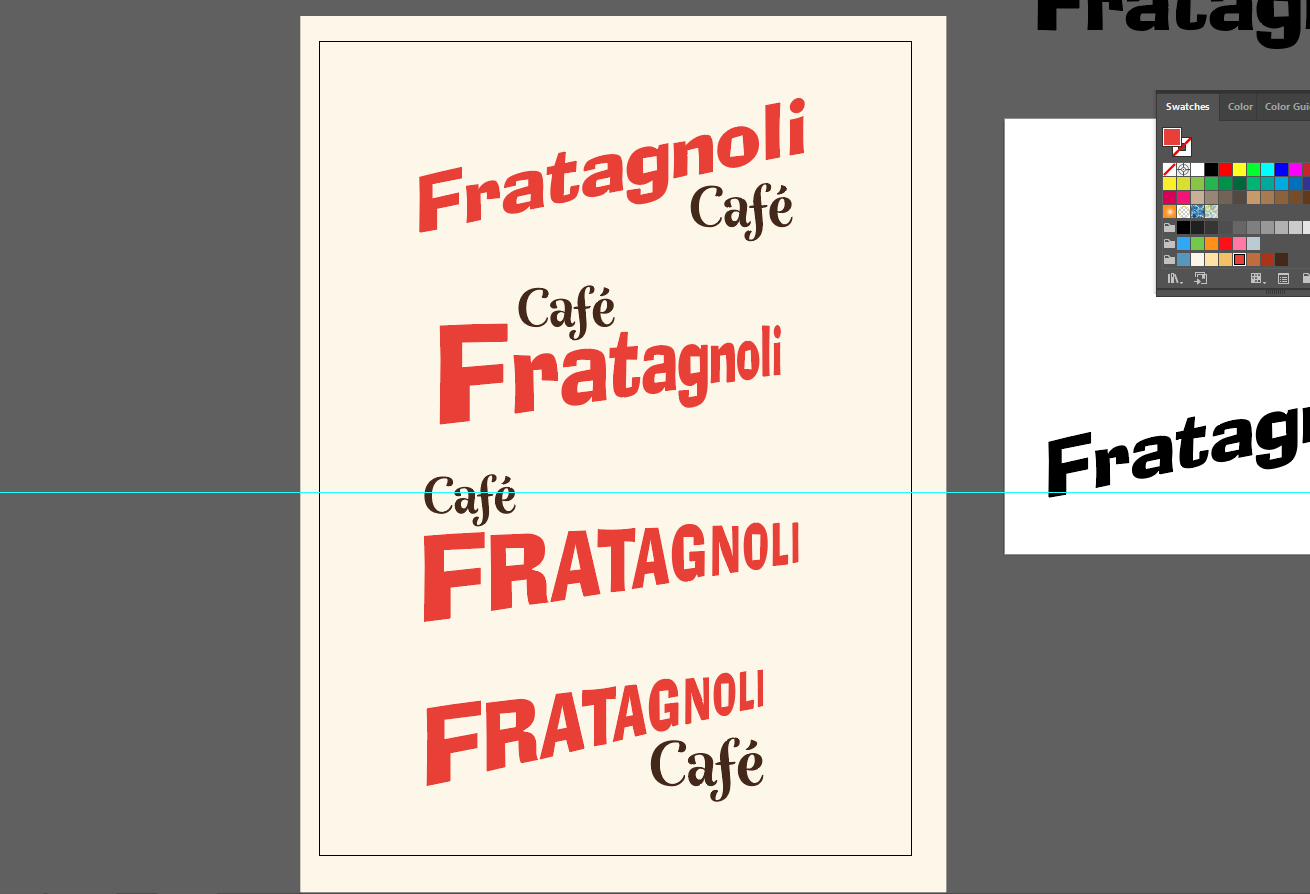
Logo development


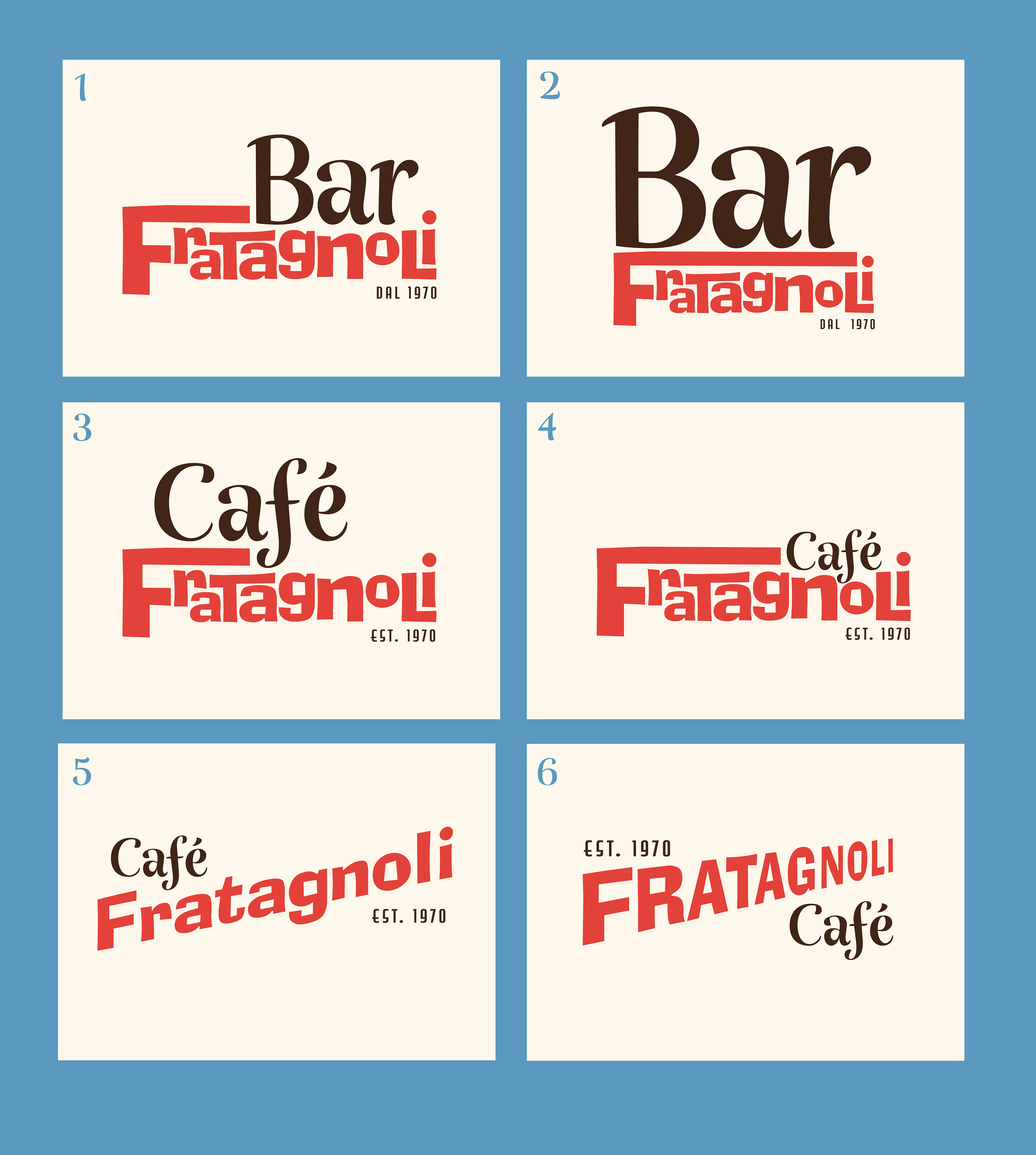
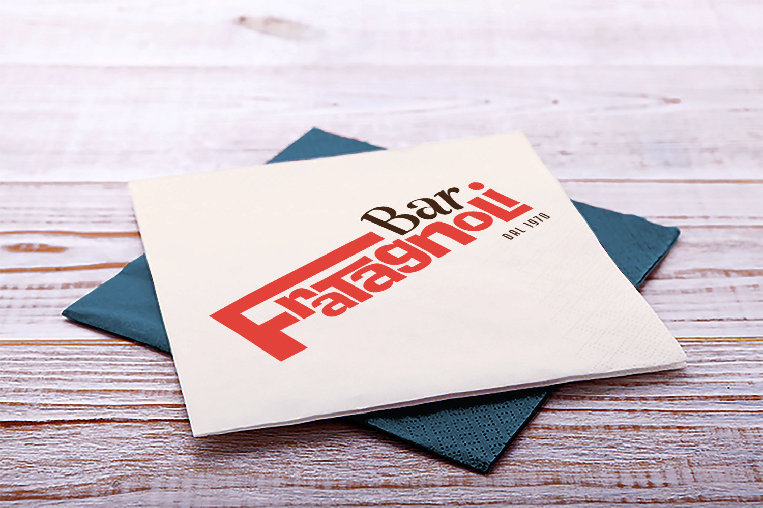
Final branding design concept
Colour Scheme
The colour scheme is based on that of typical Italian restaurant furnishings and food products.

Diaspro (Jasper) hints at the undisputed symbol of Italian cooking: The tomato.
Prima Alba (Early Dawn) reminds us of the ancient Roman buildings made of limestone and white marble.
Azzurro Celestiale (Celestial Blue) Azzuro... Adriano Celentano. Need I say more?
Quericia Profonda (Deep Oak) suggests elements such as Italian oak wine barrels and balsamic vinegar.
Logo
The logo is the foundation of Bar Fratagnoli’s brand. I suggest that all text within the café is presented in the Italian language. This creates intrigue and could lead to conversation. Young people will be attracted by the authenticity the language choice provides and the playfulness of the design’s typography.


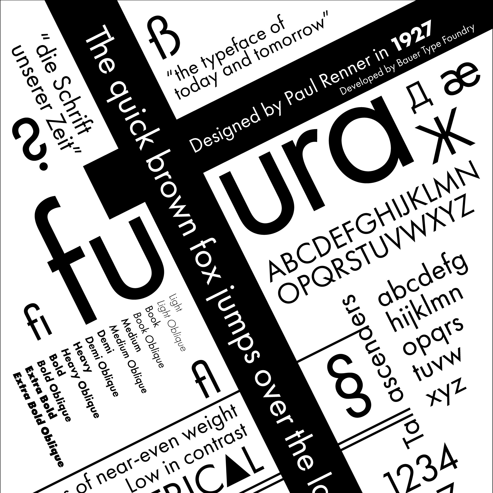
Fonts
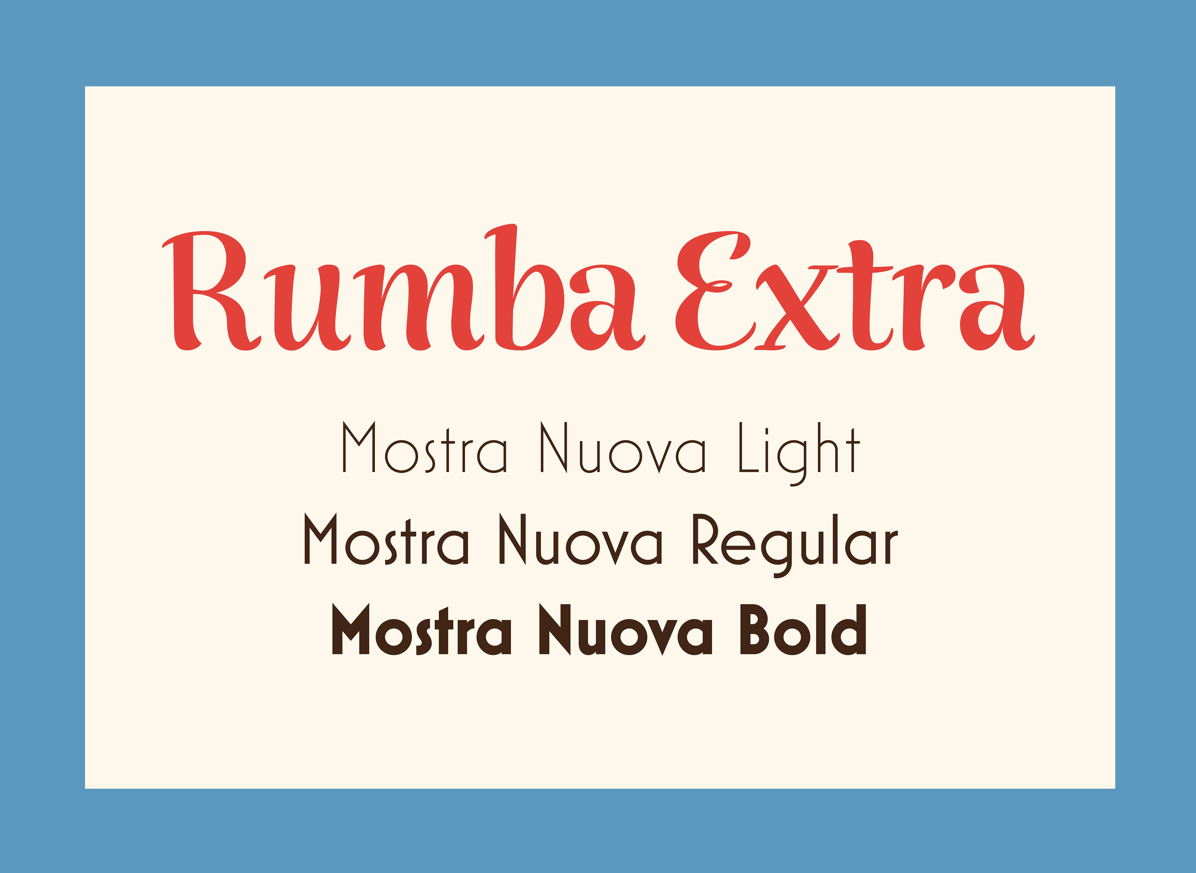
The Ad Lib font is exclusively used in the café’s logo.
Rumba is a lively and interesting font to be used for menu headers and other display purposes.
Mostra Nuova family for all other text purposes.