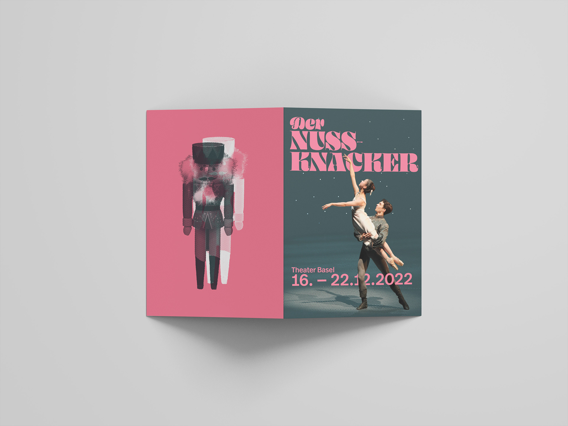
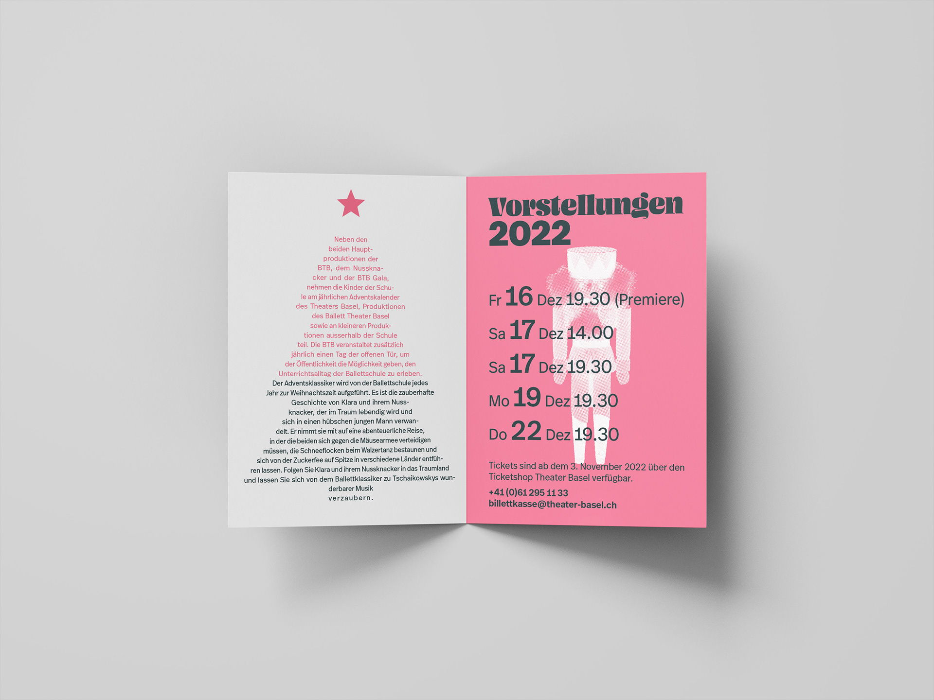
This is the design concept and mockup of a proposed A5 pamphlet that I conceived for my design studies. I used images I took as a professional photographer on assignment for the Ballettschule Theater Basel.
The design brief was to create a pamphlet for print using CMYK colours for the front and back covers and two Pantone spot colours for the inside.
The placeholder text and dates were taken from the following source: Der Nussknacker, Ballettschule (2022) Theater Basel. Available at: https://www.theater-basel.ch/de/dernussknackerballettschule (Accessed: January 4, 2023).
The placeholder text and dates were taken from the following source: Der Nussknacker, Ballettschule (2022) Theater Basel. Available at: https://www.theater-basel.ch/de/dernussknackerballettschule (Accessed: January 4, 2023).
Original photo selection for this project:

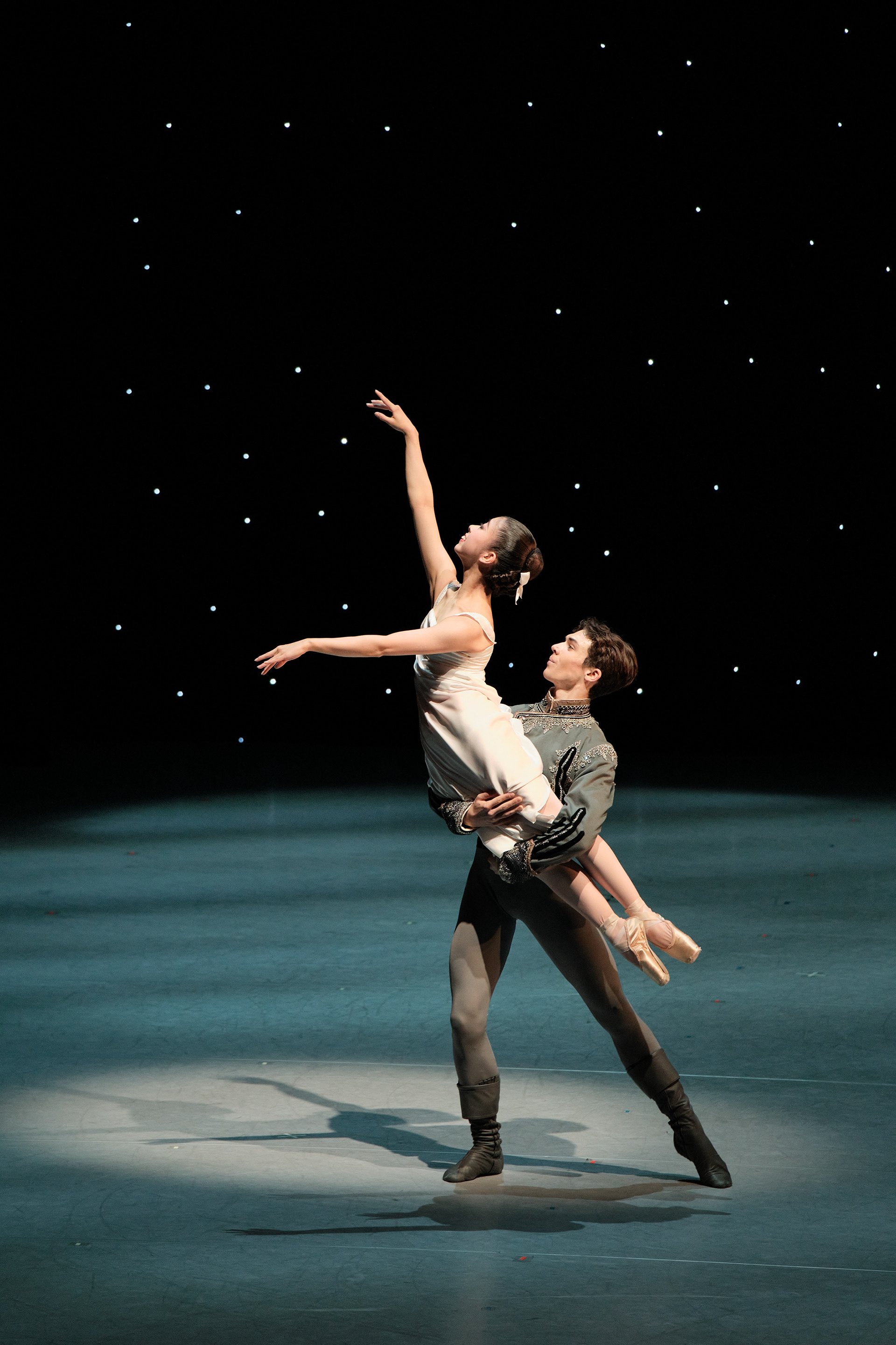
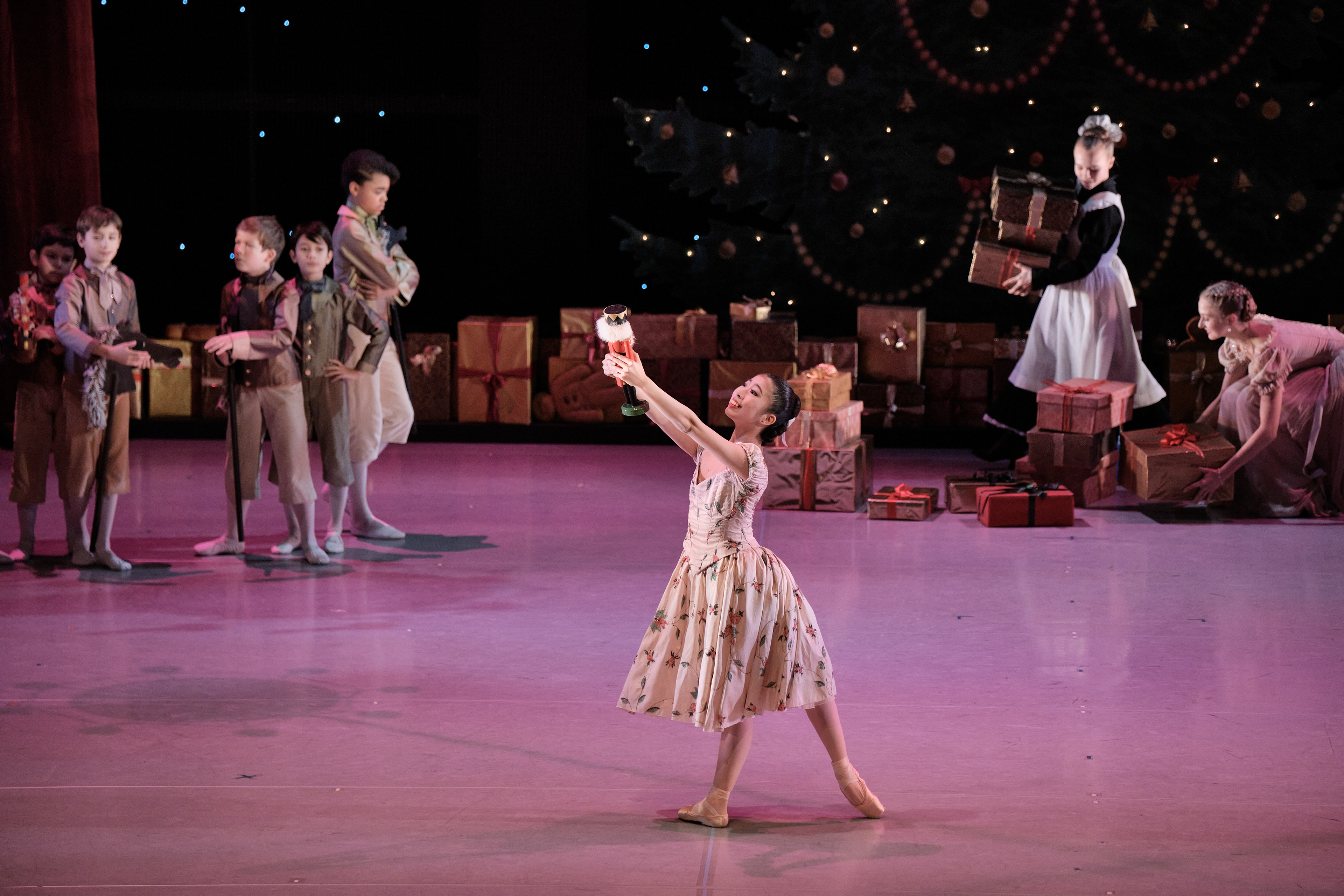
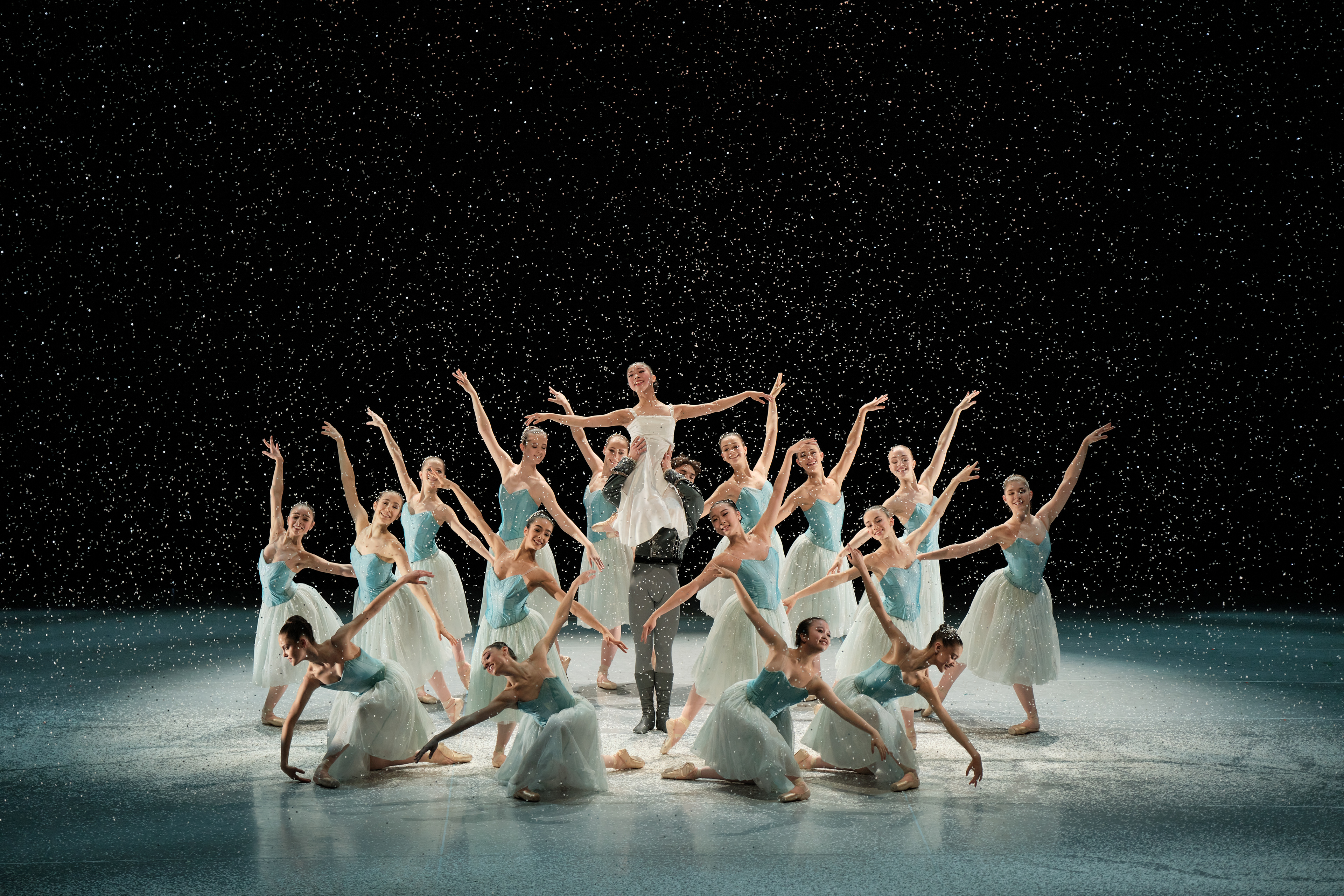
Photos copyright © Admill Kuyler.
Dancers of the Ballettschule Theater Basel in their performance of The Nutcracker 2022
Dancers of the Ballettschule Theater Basel in their performance of The Nutcracker 2022
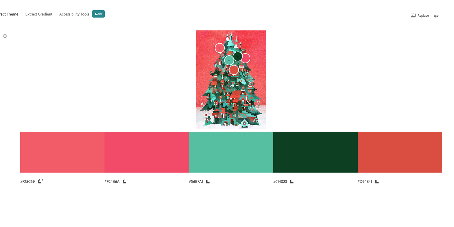
Colour palette
Initial inspiration came from the image below, which I later adjusted and converted to two Pantone spot colours.
The pastel pink and blue-green colour palette gives the design a contemporary feel, but still hints at the traditional red and green Christmas palette.
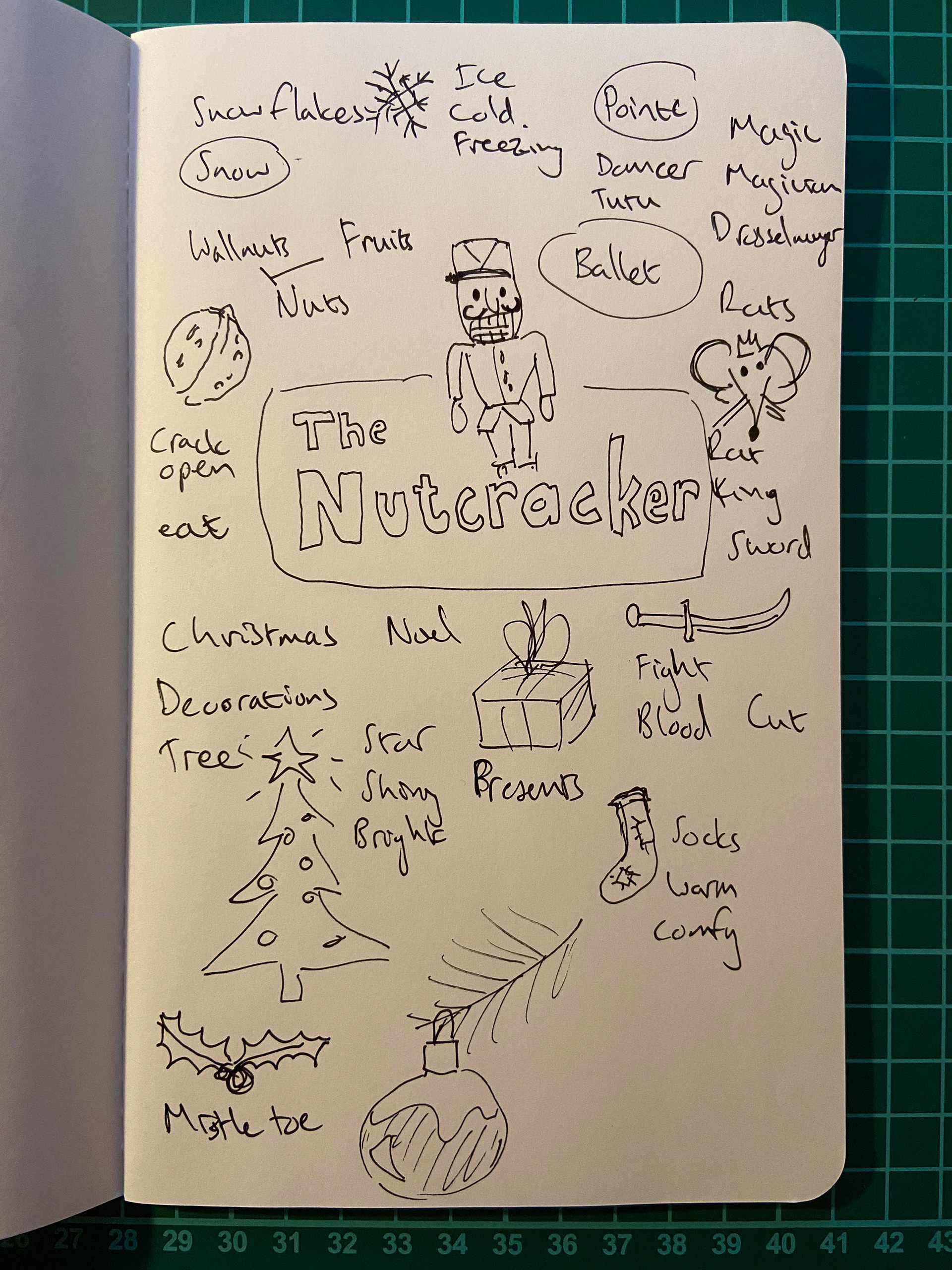
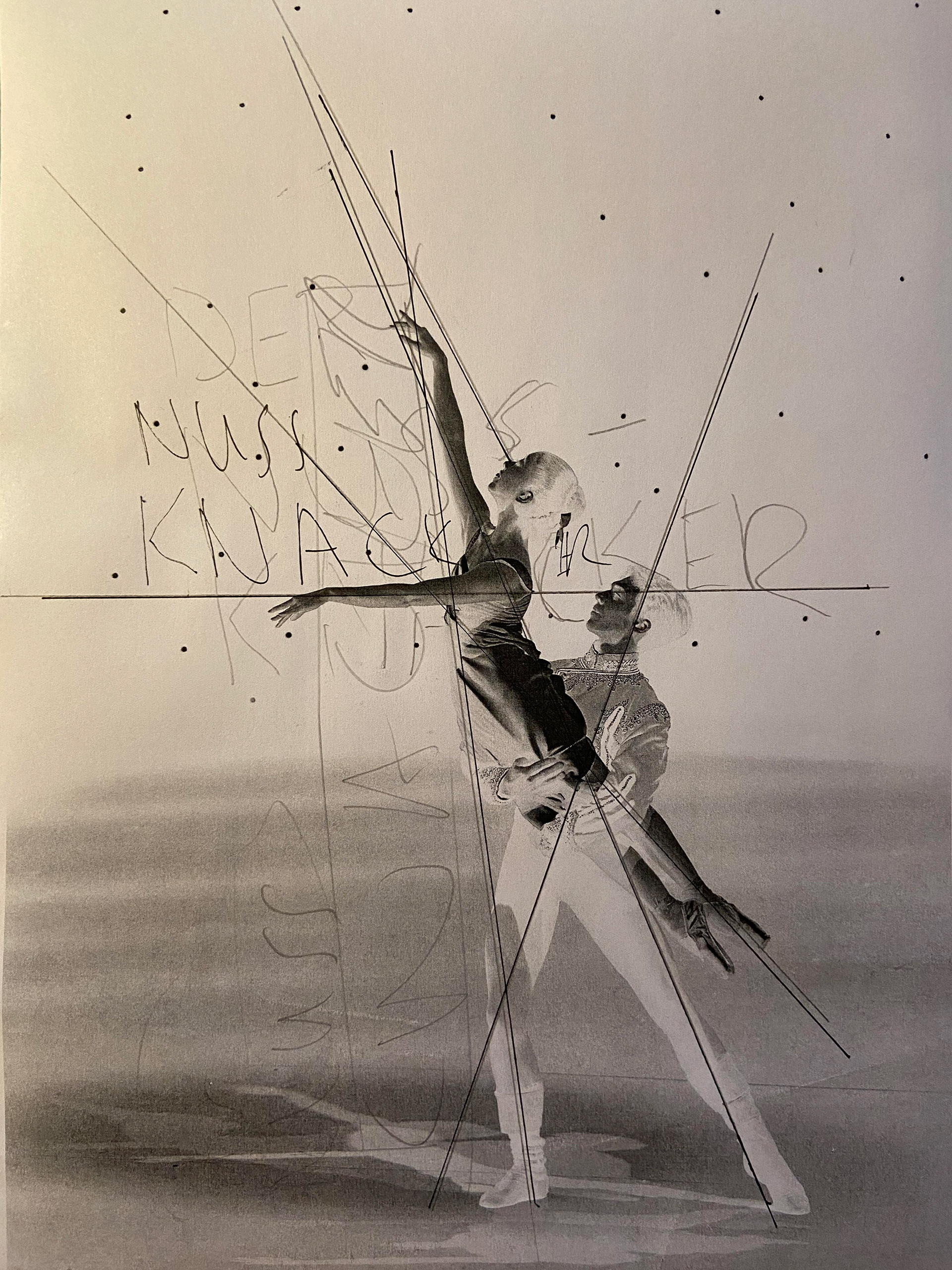
Mind-map and image analysis
My creative idea generation usually starts off with a mind-map. It is also important for me to analyse the visual dynamics of images to incorporate typography effectively.
Final design